Customize the widget
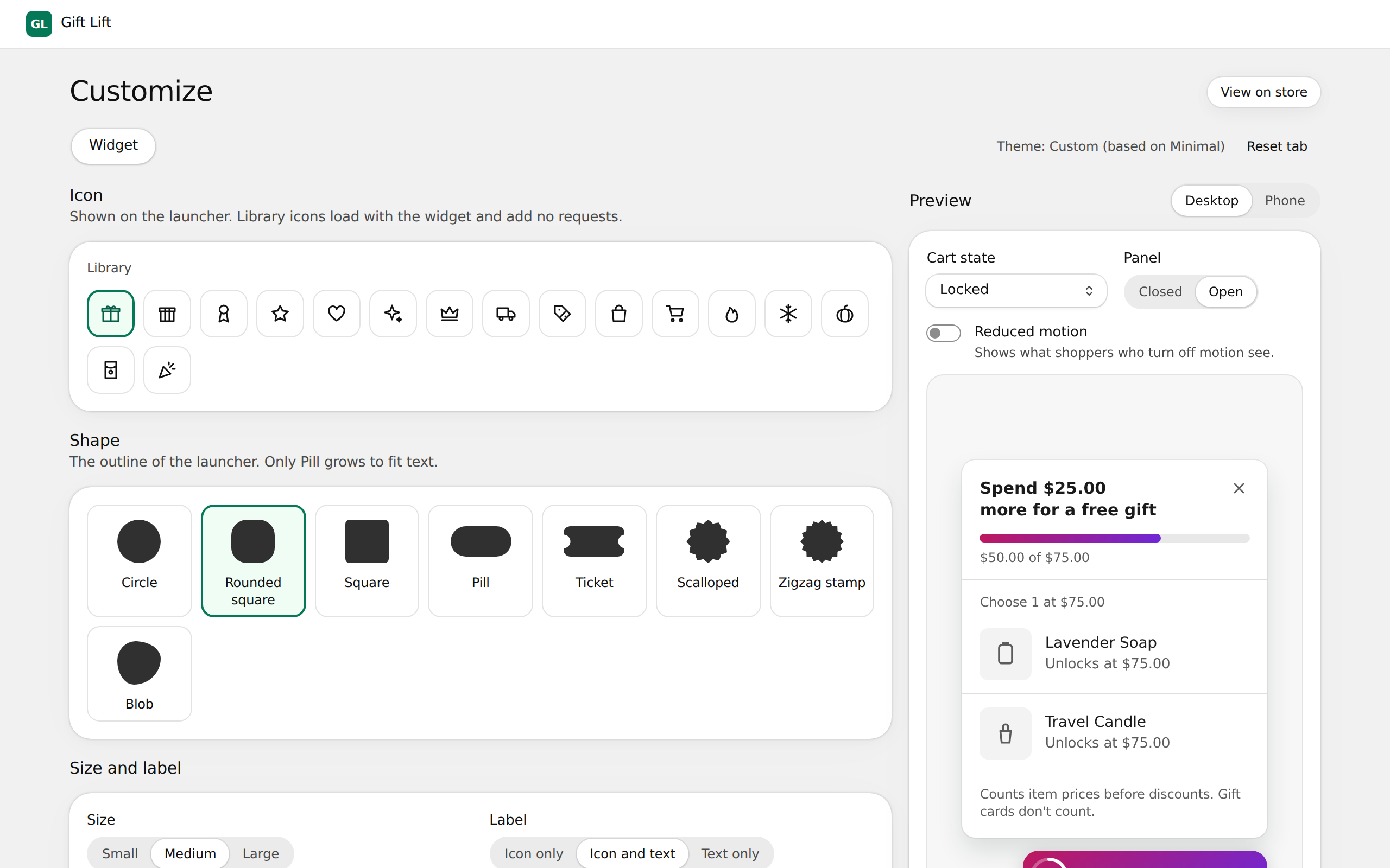
Customize controls how the gift widget looks on your store: the launcher button shoppers see on every page and the panel that opens from it.
Change the style
- In Gift Lift, open Customize.
- Change any of the options below. The preview on the right updates as you go.
- Select Save in the bar at the top of the page.
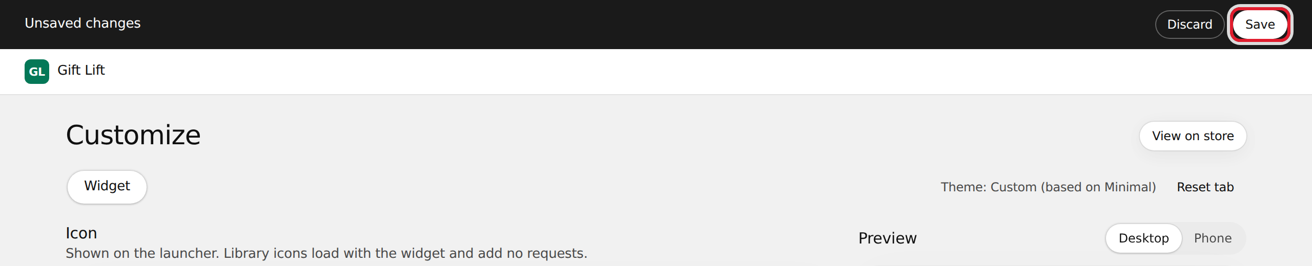
Your store updates right away and you see Widget style published. To undo unsaved changes, select Discard.
Options
| Card | What you can change |
|---|---|
| Icon | The icon on the launcher, from a library of 16 (Gift, Gift box, Ribbon, Star, Truck and more). Default: Gift. |
| Shape | The launcher's outline: Circle, Rounded square, Square, Pill, Ticket, Scalloped, Zigzag stamp or Blob. Only Pill grows to fit text. Default: Pill. |
| Size and label | Size: Small, Medium or Large (40, 48 or 56 px). Label: Icon only, Icon and text, or Text only. The text follows the cart, for example "$25.00 to a free gift". Default: Medium, Icon and text. |
| Position | Bottom right, Bottom left, Top right, Top left or Bottom center. Offset X and Offset Y set the distance from the screen edge, 0 to 64 px in steps of 4. Default: Bottom right, 16 px. |
| Progress and badge | Progress indicator: Ring, Bar, Percentage or None. Badge when a gift is unlocked: Off, Dot or Count; it hides once the gift is in the cart. |
| Colors | Fill, text, border and shadow. See below. |
| Messages | The panel titles shoppers read. See below. |
Colors
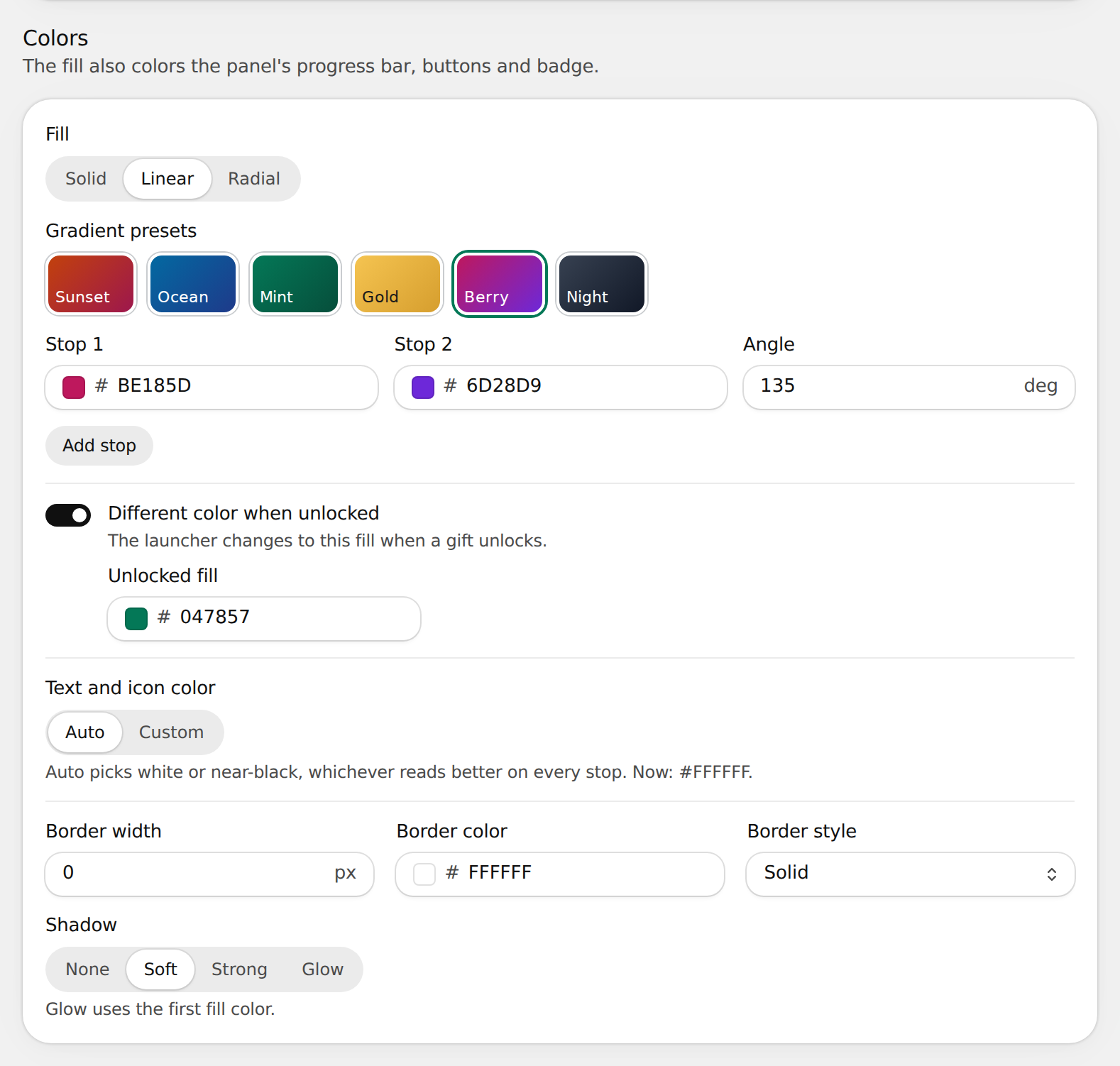
The fill also colors the panel's progress bar, buttons and badge.
- Fill: Solid, Linear or Radial. Gradients take 2 or 3 stops and an angle, or start from a preset (Sunset, Ocean, Mint, Gold, Berry, Night).
- Different color when unlocked: the launcher switches to this fill when a gift unlocks.
- Text and icon color: Auto picks white or near-black, whichever reads better on the fill. With Custom, the color must have a contrast ratio of at least 4.5:1 with the fill.
- Border width (0 to 4 px), Border color and Border style (Solid or Dashed).
- Shadow: None, Soft, Strong or Glow. Glow uses the first fill color.
Messages
| Field | Shown when | Default |
|---|---|---|
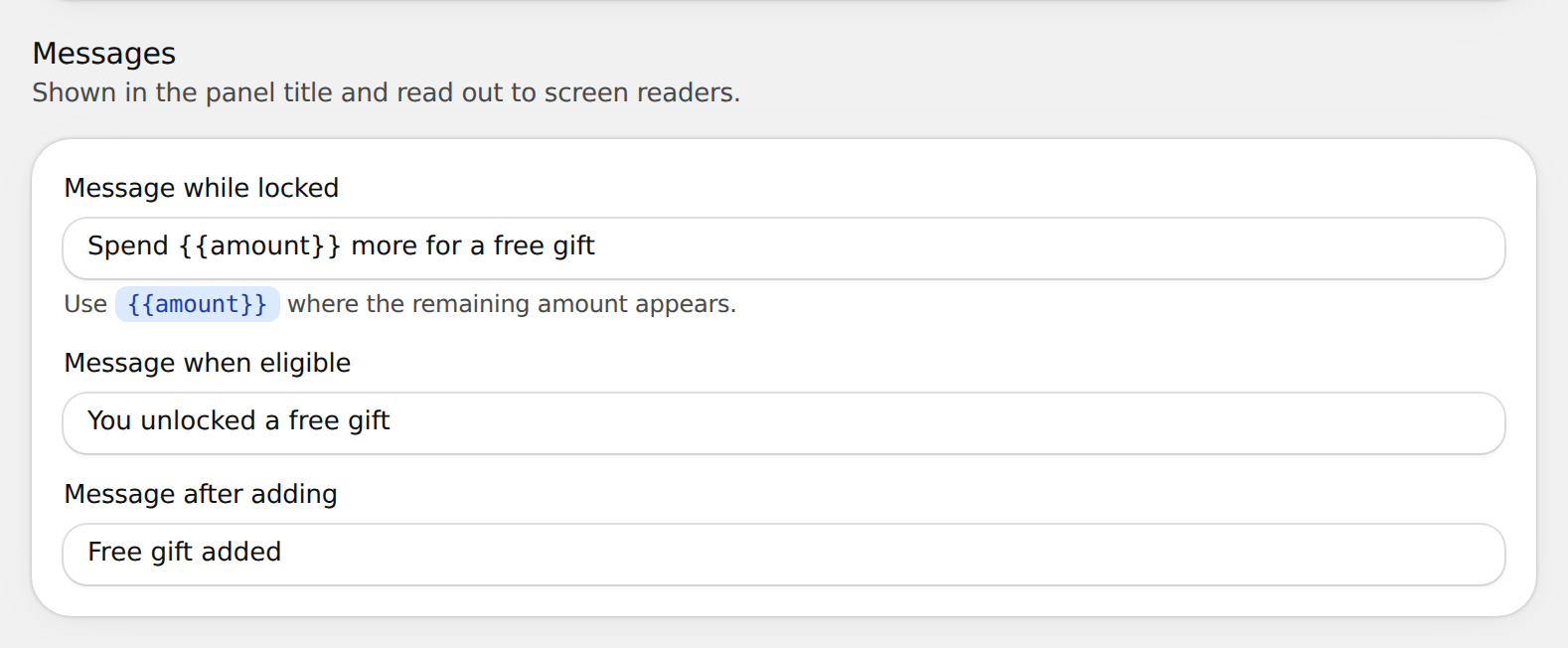
| Message while locked | The cart is below the minimum spend | Spend {{amount}} more for a free gift |
| Message when eligible | The gift is unlocked | You unlocked a free gift |
| Message after adding | The gift is in the cart | Free gift added |
Each message is plain text, 1 to 80 characters. In Message while locked, include {{amount}} once; the widget replaces it with the amount left to spend.
Use the preview
- Switch between Desktop and Phone.
- Use Cart state to see the widget before and after the gift unlocks.
- Set Panel to Closed or Open.
- Turn on Reduced motion to see what shoppers who turn off motion see.
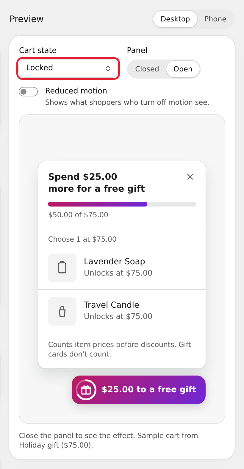
To see the widget on your real store, select View on store.
Start over
Select Reset tab to put every option back to the values of the theme shown next to it (for example, Theme: Minimal). Nothing changes on your store until you select Save.
If the page says The widget is off in your theme, the app embed is off. Select Open theme editor and turn it on. See Get started.